Almost every complaint we hear about a home — it feels cramped, it is always cluttered, nobody uses the dining room — is a layout problem wearing a decorating problem's clothes. Interior layout planning is the one decision that is genuinely expensive to reverse, because everything else is fitted around it. Get it right and a modest flat feels generous. Get it wrong and no amount of furniture will rescue it.
Here is the process we actually use, in the order we use it.
Start with movement, not furniture
Before anything is placed, we map how people move through the space across a normal day. Where do you drop your keys and bags coming in? What is the route from kitchen to table when your hands are full? Who is getting ready at the same time in the morning, and where do they collide?
Those paths are the skeleton of the plan. Furniture goes around them, never across them. A sofa that blocks the natural line from door to balcony will be walked around a hundred times a week, and the room will feel wrong without anyone being able to say why.
Some numbers worth holding onto:
- Primary walkways: 900mm clear. This is the route through a room, and it should never narrow.
- Secondary paths: 600–750mm — squeezing past the end of a bed, for instance.
- Sofa to coffee table: 400–450mm. Close enough to reach a cup, far enough to get your legs past.
- Dining chair pull-out: 900mm from table edge to the wall behind. Less, and someone is standing up every time a person leaves.
- Kitchen galley: 1200mm between runs if two people cook together; 1000mm if one does.
Zone before you decorate
Open plan does not mean undivided. A large space with no zoning reads as a corridor with furniture in it. We divide it into activities first — cooking, eating, sitting, working — and then decide what marks the boundary between them.
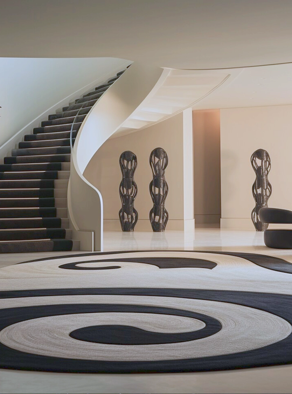
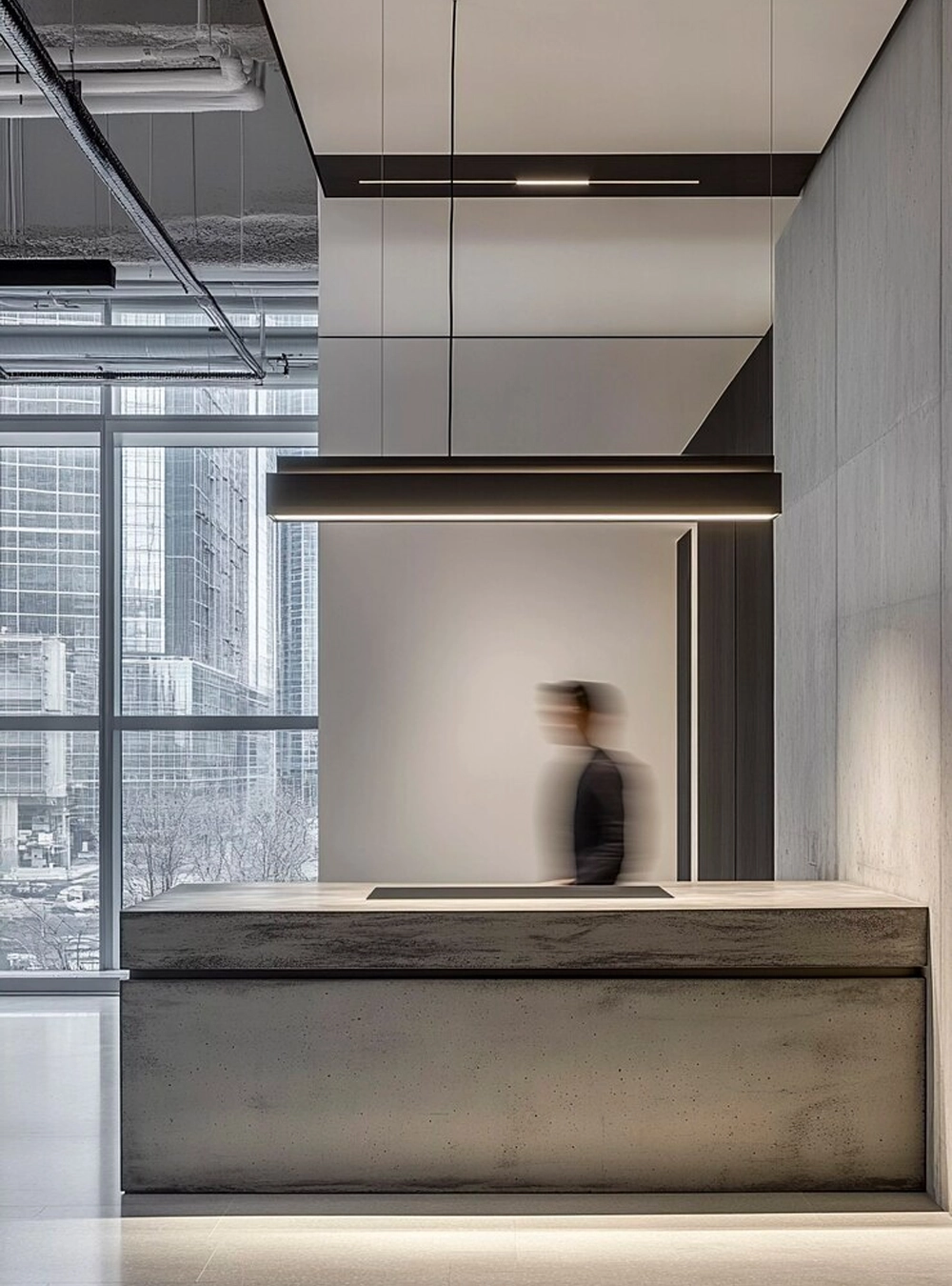
The best zone markers are things you would want anyway: a rug that defines the seating area, a change in ceiling treatment, a low console behind a sofa, a pendant that hangs over the table and nowhere else. Lighting is the most underrated zoning tool of all, because it can divide a room at night and let it read as one space by day.
The corner rule
Pushing every piece of furniture against the walls is the most common instinct and almost always wrong. It creates a dead pool in the middle and makes conversation awkward — nobody wants to talk across four metres. Floating a sofa even 200mm off the wall, with a slim console behind it, makes a room feel considered rather than lined up.
Plan storage for what you actually own
Storage is where good layouts quietly fail. The rule we work to is simple: count what has to disappear, then design for that volume plus a quarter. Not a notional amount of shelving — the actual coats, the actual bulk shopping, the actual suitcases and sports gear and paperwork.
Two principles do most of the work:
- Store things where they are used. Every metre between an object and its home is a metre of friction, and friction is what makes a house untidy.
- Go tall in the places nobody looks. The 400mm above a doorway, the run over a wardrobe, the awkward alcove — these are usually free volume that joinery can claim.
Respect the light
Note where the sun lands at different hours before you commit to a plan. A reading chair belongs where afternoon light falls; a desk belongs where a screen will not fight a window; a dining table in the path of low evening sun will be unusable half the year without a blind.
This is also the argument against blocking a window with a tall unit, however much storage it buys. Daylight is the one thing you cannot add later.
Test it before you build it
Tape the plan out on the floor. Mark the sofa, the island, the bed, the walkways. Live with the tape for a couple of days and walk the routes. It takes an hour and it catches the mistakes that drawings hide — a door that fouls a chair, an island that leaves too little standing room, a bed you cannot make from both sides.
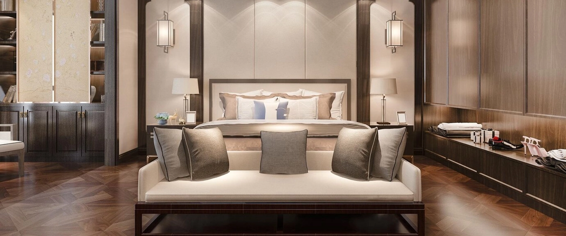
For larger changes we render the layout in 3D at eye level, which does the same job with more conviction and lets you compare two arrangements side by side.
The short version
Movement first, zones second, storage sized honestly, light respected, and everything tested at full size before it is ordered. None of this is expensive. All of it is far cheaper than discovering the problem after the joinery is in.
Planning a renovation or moving into a new space? We would be glad to look at your floor plan with you.